If you expect that we are processing some sort of moving objects, that where you are partially wrong. Video processing is just like image processing but with the time factor added. A video is captured by a camera by taking many pictures at a certain rate (e.g. 30 frames/sec, 60 frames/sec). The higher the frame rate is, the finer is the movement of the pictures.
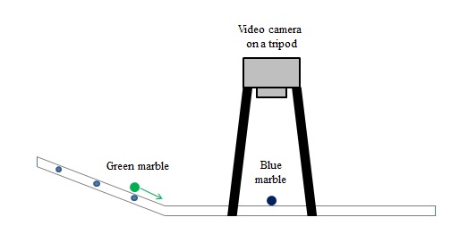
For this activity, we will be using a camera with a frame rate of 59 frames/sec. We will be verifying the Law of Conservation of Momentum for the collision of two marbles. The experimental setup is shown in Figure 2.
Figure 1. Blue marble
Figure 2. Green Marble
Figure 3. Setup used for the experiment.
A video camera is setup on a tripod for stability. The camera faces the ramp on to where the blue marble is located. The green marble is initially placed on the slanted side of the ramp to gain velocity. As the green marble enters the straight path, it will travel at a constant velocity. The camera will record the collision of the two marbles. The process is repeated two more times each with a higher velocity (higher velocity is achieved by placing the green marble further up the ramp).
For my approach on the image processing part, firstly, we cropped the image into only the relevant part. We isolated one marble using Parameteric Segmentation. We used a reference color patch of the same color as the desired marble. We then applied Morphological Operations to reshape the segmented marble into a circle. Lastly, we took the mean of the pixel locations of the segmented and morphed shape and recorded it. The whole process is repeated for the other marble.
For the video processing part, we first converted the video into an image file using the program Video to JPG converter. We noted the numbers of the initial frame (first frame where both marbles are inside the cropped frame) and the final frame (last frame where both marbles are still inside the cropped frame) with both marbles still having a circular shape. Figures 4 to 9 shows the images of the initial and final frames. From this, we created a loop in the program to perform the said image processing (from last paragraph) and gather the location data for all frames that are involved. The gathered position data will be plotted versus time. The time part will be an array created using the frame rate. The interval of each frame is 1/59 seconds.
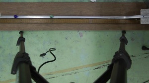
Figure 4. Slow velocity initial frame
Figure 5. Slow velocity final frame
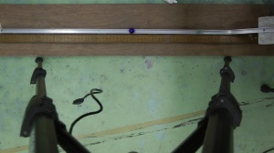
Figure 6. Medium velocity initial frame
Figure 7. Medium velocity final frame
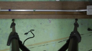
Figure 8. Fast velocity initial frame
Figure 9. Fast velocty final frame
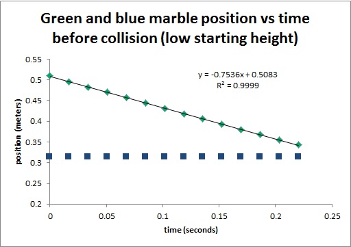
Figure 10. Initial Position vs time for low velocity
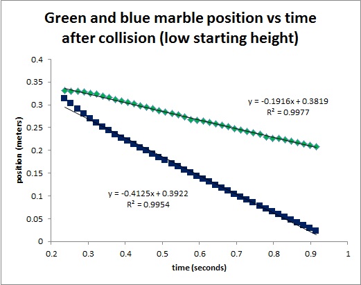
Figure 11. Final Position vs time for low velocity
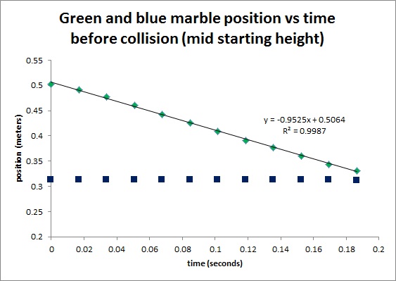
Figure 12. Initial Position vs time for medium velocity
Figure 13. Final Position vs time for medium velocity
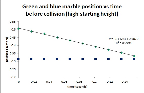
Figure 14. Initial Position vs time for high velocity
Figure 15. Final velocity vs time for high velocity
On the plots in Figures 10 to 15, the slope for the flat lines are assumed to be zero, the slopes for the other lines are displayed. The slope of a line is the first derivative of y with respect to x. For this case, the slope of the line is the first derivative of position with respect to time i.e. the velocity of the ball. Using the equation for the Law of Conservation of Momentum,
m1v1i + m2v2i = m1v1f + m2v2f
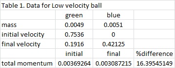
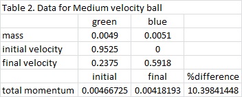
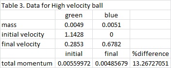
where m1 is the mass of the blue ball, m2 is the mass of the green ball, v1i and v1f are the initial and final velocities of the blue ball, and v2i and v2f are the initial and final velocities of the green ball. The marbles have a known mass of 0.0051 kg for the blue marble and 0.0049 for the green marble. The list of known values for this experiment is shown in Tables 1 to 3.
It can be observed that when the collision occurs, some of the initial momentum are lost. In Table 1, there is a 16.4% difference in the momentum of the initial as compared to the final. Tables 2 and 3 have 10.4% and 13.3% difference, respectively. But in all cases, the initial is always greater than the final. The equation for the Law of Conservation of Momentum only holds for ideal states. It means that it is only true for systems without friction, and no other outside forces to disturb the system. For this case, it obvious that the ramp has friction on the marbles that is why a decrease in momentum occurs. It is also observed during the experiment that when collision happens, marble jumping occurs. The marble jumped upward before following its intended path. In this jumping, momentum loss may have occurred. But nonetheless, momentum is still preserved and the Law of Conservation of Momentum still holds true.
Review:
First of all, I would like to thank my partner in this activity, Ralph Aguinaldo, for helping me finish this activity and for the analysis part. I would also like to thank Dr. Soriano for her continued support over us in our endeavors to finish this activity.
For this activity, I would give myself a 12 for doing all necessary work and for understanding every bit of it. It is not easy to do this activity when it is very hard to imitate an ideal system. But above all that, we have still done it and got only a small difference of at most 16%.
In image processing, there are many morphological operations. Some examples of these operations are union, intersection, complement, difference, reflection, translation, etc. These operations operate under the assumption that the structures or shapes are in binary.
The focus of this activity is the other two types of morphological operations namely: dilation and erosion. The dilation of a shape A with a structuring element B is adding A with a set Z where Z are the translations of a reflected B that when intersected with with A is not the empty set. The erosion of a shape A with a structuring element B is the set of all points Z such that B translated by Z is contained in A.
To show dilation and erosion, I generated four shapes and five structuring elements. The shapes are: a 5×5 square, a triangle (base of 4 and height of 3), a 10×10 hollow square (width of 2) and a plus sign (length of 5 each line). The structuring elements are: 2×2 ones, 2×1 ones, 1×2 ones, cross (3 pixels long, 1 pixel thick) and a diagonal line (2 boxes long). Figure 1-5 shows the four shapes being eroded and dilated (my assumption).
Figure 1. 5×5 square being eroded and dilated by the five structuring elementsFigure 2. Triangle being eroded and dilated by the five structuring elementsFigure 3. A 10×10 hollow square being eroded by the five structuring elementsFigure 4. 10×10 hollow square being dilated by the five structuring elementsFigure 5. Plus sign being eroded and dilated by the five structuring elements
To check if the outputs are correct, I performed the morphological operations in Scilab. Figures 6-9 shows the results of the morphological operations.
Figure 6. (top) Erosion and (bottom) dilation of a 5×5 square in the order same as in Figures 1-5.Figure 7. (top) Erosion and (bottom) dilation of a triangle in the order same as in Figures 1-5.Figure 8. (top) Erosion and (bottom) dilation of a 10×10 hollow square in the order same as in Figures 1-5.Figure 9. (top) Erosion and (bottom) dilation of a plus sign in the order same as in Figures 1-5.
We see that each assumption matched with the Scilab-performed output. But I will not discuss everything in detail anymore because it just follows a certain pattern. To summarize, in eroding, when the structuring element is not found within the shape on a certain pixel, that certain pixel is eroded (zeroed out). In dilating, when the structuring element is not found within the shape on a certain pixel, the shape is expanded following the shape of the structuring element.
After discussing the morphological operations, we now proceed to discussing some applications namely: Open, Close and TopHat. Open operation is an operation in which:
To examine these operations, I will also find an application to perform simultaneously. For the application, I am to isolate the “cancer cells” (big circles) from a group of “normal cells” (small circles) as shown in Figure 10.
Figure 10. Group of “cells” composed of “normal cells” and “cancer cells”
To do this, I first have to acquire a separate image to calibrate and get an approximation of the area of “normal cells”. Figure 11 shows the image to perform approximation.
Figure 11. Image of “normal cells” used to approximate its area
I separated Figure 11 into 12 subimages each having a size of 256×256. This is to get more data points and thus leading to a better approximation of the area. After separating into subimages, I will use one to discuss the effect of the three operations discussed earlier (Open, Close, TopHat). Figure 12 shows one of the subimages which will be used. Figure 13 shows the effect of the open operation, Figure 14 shows the effect of the close operation and Figure 15 shows the effect of the tophat operation.
Figure 12. Subimage to be used.Figure 13. Result after opening the Figure 12.Figure 14. Result after closing Figure 12.Figure 15. Result after performing tophat on Figure 12.
Notice that in Figure 12, we see small unwanted white spots. These white spots are clearly not part of the circles. In performing the morphological operations, I used a structuring element in the shape of a circle with a radius of 10. In Figure 13, we see that the unwanted white part have disappeared after opening the image. In Figure 14, the image have been completely distorted and only a few white circles are observable. In Figure 15, the unwanted white sport have not disappeared and to make things worse, the white circles have disappeared and only the outline remains. It is clear what the better option for the operation to be used is here. The properly clean the image, we need to use the open operation.
Going back to isolating the cancer cells, we now have a method to clean the given image in Figure 11. For each subimage, after cleaning with the open operation, we searched for blobs or a group of white pixels enclosed by black pixels. We label each blob and extract their area in terms of number of pixels. We then plot the histogram of the number of blobs based on blob area. The histogram is shown in Figure 16.
Figure 16. Histogram of blob count based on blob area for Figure 11
We see that the histogram is high at values in between 300 pixels and 600 pixels. Areas below that will be too small to be considered as a “normal cell” while values above that will be considered as a clump of cells which will then be rejected because it cannot be of any help in the approximation of the area of a “normal cell”. We then get the mean area and its corresponding standard deviation of those blobs above 300 and below 600 pixels. These values will be used to find the “cancer cells” in Figure 10.
In Figure 10, we perform the same binarization process and clean the image using the same open operation but now with a structuring element in the shape of a circle of radius 13. We then searched the whole image for blobs and labelled each. The histogram for blob count using blob area is then plotted. Figure 17 shows the said histogram.
Figure 17. Histogram of blob count using blob area of Figure 10
After cleaning, only a few circles now remain. We notice that there are peaks less than 600. These peaks will resemble the area of the “normal cells”. A group of peaks are then observed above 800 pixels. This will resemble the area of the “cancer cells” thus when removing those blobs covered by the range (mean – standard deviation) to (mean + standard deviation) which are calculated earlier. Figure 18 shows the resulting image of the isolated “cancer cells”.
Figure 18. Isolated “cancer cells” in black and white
If we compare Figure 18 with Figure 10, we see that they match with the known observed “cancer cells”. This means that this process is effective in isolating shapes based on area.
For my above and beyond study, I will try to find a situation in which the tophat operation is used. I will take an image as shown in Figure 19. It shows a text with something that looks like a spilled ink.
My first step is to take the negative of the image and perform the tophat operation using a square structuring element with a side length of 6. Figure 20 shows the resulting image.
Figure 20. Result after performing tophat operation
We can now see that the color of the ink stain is now starting to merge with the background while the color of the text remain white (due to applying negative). From here, we can completely remove the stain by segmenting by threshold and the result is shown in Figure 21.
Figure 21. Resulting image after thresholding
Although the ink stain is gone, we now observe several unwanted white patches around the letters. To fix this, we return to Figure 20 and apply a limit to thresholding. We create a patch similar to that of Figure 22 and apply lower thresholding to where the patch is white. We apply higher thresholding to the rest. The resulting image will be shown in Figure 23.
Figure 22. Patch used to perform operationsFigure 23. Result after separate thresholding
To further enhance the image, we can use the earlier images (make use of black background) to arrive to a final enhance image shown in Figure 24. The image will then be reinverted to return to black text.
Figure 24. Final enhanced image
Review:
First of all, I would like to thank my classmate Ralph Aguinaldo for sharing ideas with me while figuring out how to perform this activity. I would also like to thank Maam Jing for the guidance and for confirming my results.
Secondly, I would like to say that this activity really exposed the artist (or non-artist) in me. This activity was fun but the above and beyond part really made me think hard. For that, I would like to give myself a grade of 12 for this activity.
Image segmentation is an important concept in Imaging. It sets a threshold to the image and binarize the image according to that threshold. Binarization is a process in which the colored image is converted to an image composed only of black and white pixels. For example, let us take the image in Figure 1.
Figure 1. Sample Image for segmentation
This image is composed of black ink (for the text) and light grayish paper (for the background). I want to binarize Figure 1 such that the text will be white and the background will be black. To do that, first I need to plot the histogram of pixel values. I used the function imhist() of Scilab with 256 bins. Figure 2 shows the histogram of pixel values for the image in Figure 1.
Figure 2. Histogram of pixel values for Figure 1
It is observed that there are so many pixels with values greater than 150 as compared to those less than it. In Figure 1, the background is also dominant so the pixels with values greater than 150 are the background pixels. Since I want the background to be black and the text to be white, I let a matrix BW = I < 125 (giving a small allowance to the threshold) with I being the image matrix. This will create a matrix BW with values T or F (True or False) with T be white and F be black. Figure 3 shows the binarized image of Figure 1.
Figure 3. Binarized image of Figure 1 with threshold value of 125
I can use the segmentation concept to isolate a certain color in colored images. Before proceeding to segmenting colored images, I will need to discuss a little bit about colored images. Per pixel in a colored image has a particular color and this color is a combination of the three primary colors: red, green and blue. Colored images will then have a separate channel for each color (R for red, G for green and B for blue). Before segmenting, the three channels of the image have to be converted to normalized chromaticity coordinates or NCC. To do this, I let:
Equations 1-4: Equations to be used to convert to NCC
The terms r (Equation 2) and g (Equation 3) will be the coordinates in the NCC. Note that I did not use the b value (Equation 4) because when I know r and g, I already know b because r + g + b = 1.
Now before calculating anything, I must choose a photo wherein there are many colors involved. I chose a photo of a Korean girl group in one of their music videos where they wear tracksuits of five different colors as seen in Figure 4.
Figure 4. Image to be segmented. Retrieved from Bar Bar Bar music video of Korean Girl Group Crayon Pop
I then choose a region of interest or ROI wherein I want to isolate that certain color. I chose the five different colors simultaneously to perform this activity faster.
Figure 5. a) Yellow b) Pink c) Orange d) Blue e) Red color patches used to segment based on color
I solved for the chromaticity coordinates r and g of each pixel on each color patch. I then took the mean and standard deviation values of r and g for each patch. These values are important to setup the Gaussian distribution for the probability of belongingness for each pixel on the original image. Using the equations 5 and 6 below, I will then solve for the probability of belongingness of each pixel on the original image.
Equations 5-7: Equations to solve for the probability of belongingness
I then solved for the belongingness probability for each pixel with the mean and standard deviation values that I calculated from the patches. Since there are values of P(r,g) that are greater than one, I normalized the probability function to only have values from 0 to 1. As of now, each pixel now has a belongingness probability value. I can use these values to perform the threshold segmentation. I tried different thresholds and Figure 6 shows the results of segmentation.
Figure 6. Segmented image of Figure 4 using the color yellow and with thresholds a) 0.1 b) 0.4 c) 0.7 d) 0.9
It is observed in Figure 6 that as the threshold increases, less white pixels are observed. It is expected because the binarization process is reliant on the value of the probability of belongingness. The higher its probability, the more chances it is to be white on the binarized form.
For the rest of the color patches, I only used a single threshold value of 0.4. Figure 7 shows the rest of the segmented images.
Figure 7. Segmented images of a) pink b) orange c) red d) blue color patches with a threshold of 0.4
The process shown above is called Parametric segmentation since it uses a Gaussian Probability Distribution Function as a threshold basis. There is another method of segmentation and this is called the Non-parametric segmentation. This type of segmentation uses the concept of histogram backprojection wherein the r and g values of the image pixels are compared to a 2D histogram of a certain color patch. The value of the image pixels are then changed depending on the value on the histogram.
To start with non-parametric segmentation, I will give a little discussion on 2D histograms. Given the values of r and g, I can predict the color of that pixel using the normalized chromaticity space like that in Figure 8.
Figure 8. Normalized rg Chromaticity Space
A 2D histogram is formed when the r and g values of each pixel on the original image is calculated. The plot of the NCC space (Figure 8) is divided into bins and be used as basis. Originally, each bin has a value of 0. Each time a pixel’s r and g values correspond to a certain bin, the value of that bin increases by 1. When all the pixels have now been incorporated to the histogram, the histogram is then normalized and binarized using a threshold. When the value of that bin exceeds the set threshold, it will be given a value of 1 (white) and 0 (black) otherwise. The histograms are created using the color patches seen in Figure 5. The histograms generated are shown in Figure 9.
Figure 9. Binarized histograms of the a) yellow b) pink c) orange d) blue e) red color patches
If I compare these histograms with the NCC space in Figure 8, I can see that the white spots are located in the proper color location. After checking, I can proceed to the next step which is histogram backprojection. The pixels of the original image will become white when the histogram values of the corresponding r and g values of the pixels are 1. When the histogram values are zero, the pixel is changed to black. This will then be segmented based on the color of the patch. The resultant image of the non-parametric segmentation is shown in Figure 10. The threshold used for all of the images will be 0.4 (same threshold as that I used in parametric segmentation).
Figure 10. Segmented images with a)pink b) orange c) red d) blue e) yellow color patches and using non-parametric segmentation with a threshold value of 0.4
When comparing the results of the parametric (Figure 7) and non-parametric (Figure 10) segmentation, I noticed that, with the same threshold, parameteric segmentation has a clearer image of the isolated color than non-parametric segmentation. The reason for this is that many information are lost when the histogram is being binarized in the non-parametric segmentation. Also, due to the Gaussian PDF of the parametric segmentation, a large scale of pixels will be involved.
The difference in runtime is in favor of parametric segmentation. This is not what is expected but because of the capability of Scilab to perform parallel computations within matrices, this made the difference. In non-parametric segmentation, a histogram must be setup and values are compared and this caused the delay while in parametric segmentation, values are calculated simultaneously and is just thresholded.
In this activity, I will explore above and beyond by tackling on the topic on choosing color patches. For the color patches shown in Figure 5, they are all of the same saturation (no dark nor light versions of the same hue). One of the reasons why not the whole clothes were segmented above is that they did not reach the threshold. If I do not want to change the threshold, I can just change the color patch itself. Let us take for example the image of the sky in Figure 11.
Figure 11. Image of the sky
I want to segment the image such that the sky will turn white (while all the rest are black) while having a constant threshold of 0.1. If I pick a patch like that shown in Figure 12, we can expect that most of the sky will be blacked out. The result of this color segmentation is shown in Figure 13.
Figure 12. Color patch selectedFigure 13. Segmented image using the color patch in Figure 12
I notice that only the upper parts are whited out. If I choose another patch like that shown in Figure 14, we can expect another bad segmentation. The resultant image will be shown in Figure 15.
Figure 14. Color patch selectedFigure 15. Segmented image using the color patch in Figure 14
Now the lower parts are white but the higher parts are black. If I change the color patch such that a wide range of color saturation are observed, we can expect much better results. Figure 16 shows the patch with a wide range of saturation and Figure 17 shows the segmented image.
Figure 16. Color patch selectedFigure 17. Segmented image using the patch in Figure 16
This happens because a wide range of color saturation will bring the mean to the real average of all the blue pixels. The standard deviation also increases greatly thus leading to a larger Gaussian PDF. This means that more pixels will then be included even though the threshold is at a strict 0.1. Although it may not be perfect, the point here is to show how choosing the right patch can also be a way to perform better segmentation.
Review:
To think about it, this activity was given only six days to make and I finished the programming part after two days. This means that I went “in the zone” because this activity is so awesome. For this activity, I would congratulate myself for all the effort I put here. Also, I really understood the topic very well. Since it’s alerady October and Christmas is coming fast, I will give my self a Christmas-themed score: 12! Because…
The 2D Fourier Transform is a good concept since it detects frequencies of periodic patterns. Applications of the 2D Fourier transform may range from Ridge Enhancement, Pattern Removal, etc. Some of these applications will be discussed later. First, I will discuss the basic properties of the Fourier transform.
As discussed in the previous blog, when a large image is transformed to Fourier space, it will become smaller and when a small image is transformed to Fourier space, it will become larger. This property is called anamorphism. For the 2D Fourier transform, anamorphism works independently for the x-axis and y-axis. To demonstrate anamorphism, I generated four different types of images: tall rectangle aperture, wide rectangle aperture, two symmetric dots and two symmetric dots with wider separation.
Figure 1. Images generated to demonstrate anamorphism
For the tall rectangle (Figure 1 top left), we will expect a wide rectangle with a repeating slit pattern on each axis. For the wide rectangle (Figure 1 top right), we will expect a tall rectangle with a repeating slit pattern on each axis also. For the symmetric dots (Figure 1 bottom left), we will expect a sinusoidal pattern similar to that of the corrugated roof. For the symmetric dots with wider spearation (Figure 1 bottom right), we will also expect another sinusoidal pattern but with a smaller wavelength. To check the predictions, we get the Fourier transform of each image:
Figure 2. Fourier transforms of the images in Figure 1
As expected, the results match the predicted Fourier transforms. Anamorphism was demonstrated in the two images (Figure 1 top), a taller image will seem small in the Fourier plane and vice versa. For the case of the symmetric dots, as seen in the previous blog, it should be the Fourier transform of a sinsuoidal wave. Since the Fourier transform of anything in the Fourier plane will just return to the space plane, two symmetric dots will result to a sinusoidal pattern. This applies to the second symmetric dots (Figure 1 bottom right). The pattern seemed thinner because the dots now represent a higher frequency thus having a smaller wavelength. Anamorphism is also observed for the dots. When the dots are closer to the center (smaller gap between them), the sinusoid will have a smaller frequency thus having a wider wavelength and vice versa.
Now we will discuss the rotation property of the Fourier transform. To demonstrate this, I generated four sinusoidal waves of different angle of rotations (0°, 30°, 45°, 90°) as seen in Figure 3.
Figure 3. Images used to demonstrate rotation
For the rotation property of the Fourier transform, I predict that the transform will also be rotated in the same direction and the same angle as that of the rotation in the image space. To again check the predictions, we get the Fourier transforms of the images:
Figure 4. Fourier transforms of the images in Figure 3
Again, as expected, the Fourier transforms just rotated in the same direction and angle. It is observable for all images in Figure 4. This happens because in the Fourier space, the dots appear on the axis where the periodic pattern (sinusoid) is observed. If the image is periodic along the x-axis, the dots will appear on the x-axis. When the image is rotated, the axis where the sinusoid resides also rotates. This is why the dots also appear on a rotated axis.
This time, I will discuss another property of the Fourier transform which is the combination so I created a pattern in which two types of sinusoids are present: one in the x-direction and the other in the y-direction as seen in Figure 5. I created four of this pattern with different frequency combinations for each.
Figure 5. Images with two types of sinusoid and with different frequency combinations
The images above are generated by multiplying two sinusoids (one running in the x-direction and the other in the y-direction). Each image above also have different frequency combinations. Since the images above are a product of two sinusoids, the Fourier transform of the product of two functions is the convolution of the individual Fourier transforms of each function. Since the Fourier transform of sinusoidal waves are two dirac delta peaks, the convolution of two dirac delta peaks on two dirac delta peaks will be four dirac delta peaks. The peaks will be located at points with the correct x and y frequency combinations. The frequencies present in Figure 5 will be: 1 Hz in x-axis, 1 Hz in y-axis (top left), 0.5 Hz in x-axis, 0.5 Hz in y-axis (top right), 1 Hz in x-axis, 0.5 Hz in y-axis (bottom left), 0.5 Hz in x-axis, 1 Hz in y-axis (bottom right).
Figure 6. Fourier transforms of the images in Figure 5
The expected results were correct and the dots seem to be located on the correct points in the Fourier plane. Also note that the results in Figure 6 are also the convolution of the individual Fourier transforms of the sinusoids with different frequencies. This conforms with my predictions. To tackle further the discussion on rotation, I created a new image with three different type of sinusoidal waves: one along the x-axis, another along the y-axis and the last along an axis rotated 45°. As discussed above, since the Fourier transform of the product of two functions is the convolution of the individual Fourier transforms of each, convolving two dirac delta peaks into two dirac delta peaks into two two more dirac delta peaks should result to eight peaks. The predictions agreed with the results as shown below in Figure 7.
Figure 7. The image generated to demonstrate combinations and rotations (left) and its Fourier transform (right)
For the next part, I will show some common patterns observed in many images and discuss how to use Fourier transform to deal with it. I already discussed symmetric dots above and how they have a sinusoid for a Fourier transform. This time, I will discuss symmetric circles, symmetric squares and symmetric Gaussian curves.
Figure 8. Symmetric circles with different distance between them (88, 68, 48, 28 units)
Since we have learned about convolution above, we know that these image are just a convolution of a circle and a dirac delta function. The transform of a convolution is just the product of the individual transforms of each function. Also, we know that the transform of a circle is an airy disk pattern and the transform of a dirac delta function is a sinusoid. For the transforms of the images, we should expect an airy disk pattern with a sinusoidal varying intensity. Along the four images, they differ by separation. In a dirac delta function, when the peaks come closer to the center, the wavelength of the sinusoid is larger and vice versa. So here, we expect the same for the circles.
Figure 9. Fourier transform of the images in Figure 8
It may not be noticeable but the sinusoids in each image have different frequencies. This agrees with our predicted results. Also, this same pattern will be observed for the symmetric squares and the symmetric Gaussian curves.
Figure 10. Symmetric squares and its Fourier transform (top) and symmetric Gaussian curves and its Fourier transform (bottom)
Another common pattern observed in many images are dot patterns. It may be random dots or an array of dots. I generated four images: one with a random dot pattern and the three with evenly spaced dots of different spacing between dots.
Figure 11. The dot patterns generated
The Fourier transform of the images on Figure 11 is shown at Figure 12.
Figure 12. Fourier transform of the images in Figure 11
In the first image (top left), we notice that the Fourier transform of randomly placed dots is also like a pattern of sinusoidal waves joined together. Since there are 10 peaks with a counterpart peak on the opposite side (with respect to the center), there would at least be 10 sinusoids joined together in Figure 12 (top left). For the other three images, peaks are also observed in the Fourier transform. ALso we notice that anamorphism is observable here. As the gap between dots become larger in the space plane, the gaps between dots become smaller in the Fourier plane. This part of this activity is only to be familiar of the common patterns found on certain images and to be able to remove them using filtering.
Since we are done discussing the properties of the Fourier Transform, we now go to its applications. It is important to note that most of the applications that will be discussed here will be dealing with convolution.
The first application will be dealing with ridge enhancement. In images of fingerprints of people, we notice that sometimes, blotches occur and the lines may appear unclear. To get a better image than the raw fingerprint image itself without altering anything, we use filtering to remove unnecessary frequencies.
Figure 13. Image of my own fingerprint
First of all, and the most important part, we will take the Fourier transform of the fingerprint image and take its logarithm (due to high range of values). The resultant image is seen in Figure 14.
Figure 14. Fourier transform of the image in Figure 13
We can see that the Fourier transform of my fingerprint shows an image with a bright central point and two unclear rings around it. We know that these points on the ring correspond to a frequency on the image. Since it is difficult to make a filter manually, I automated the creation of the filter and used a threshold value of 0.45. Since I know that the values on the transform range from 0-1 only, everything below 0.45 will be zeroed out and everything above or equal to it will be equal to 1. The generated filter will be shown in Figure 15.
Figure 15. The generated filter with a threshold of 0.45
By convolving the filter with the transform of the fingerprint, we get an enhanced image shown in Figure 16. Some parts of the blotches seem to disappear and the gaps on the fingerprints are fixed.
Figure 16. Original fingerprint (left) with the filtered image (right)
Although it may not be very noticeable but the changes are there if you look closely into the image. Also, a better filter may make better results.
Another application to be discussed here is pattern removal. Based on the known knowledge about the Fourier transform, we can already deduce that we can spot patterns using this method. If we can spot the patterns, we can also remove them by filtering. The next image is a photograph captured by the NASA Lunar Orbiter.
Figure 17. Photograph with observed repeating vertical line pattern (captured by the NASA Lunar Orbiter)
First of all, get the Fourier transform of the image in grayscale. I used the logarithm scale again due to the large difference in values. Figure 18 shows the Fourier transform of the image in Figure 17.
Figure 18. Fourier transform of the image in Figure 15
I know that the vertical lines are similar to that of the sinusoidal pattern and similar to that of the horizontal lines so I created a filter that can eliminate the peaks on the x- and y-axis. The created filter is shown in Figure 19.
Figure 19. Filter created to eliminated the vertical and horizontal lines in Figure 17
We note that the center of the filter is hollow. It is because the center peak resembles the addition of a bias to the image. It also contains important information on the very small frequencies. The resulting image after convolving the filter and the Fourier transform of the original will image will be shown at Figure 20.
Figure 20. Original image in grayscale (left) and the filtered image (right)
It shows a very significant result in such a way that most of the vertical and horizontal lines disappeared on the second image. To spice things up, I tried doing the Fourier transform with the individual Red, Greed and Blue channels of the image to retain the color. The result can be found in Figure 21.
Figure 21. RGB version of the images in Figure 20
The last image to be cleaned is an oil painting from the UP Vargas Museum Collection. In this image, we see the canvas weave that look like small dots scattered almost evenly over the image.
Figure 22. Oil painting with a canvas weave pattern
I converted the image into grayscale and used Fourier transform on it. The resulting image is shown in Figure 23.
Figure 23. Fourier transform of the image in Figure 22
In Figure 23, we notice that there are white peaks symmetric along the center of the image. Also, we notice that in Figure 22, the canvas weave pattern seem to be similar to that of Figure 11 (top right). To eliminate those dots, we must filter the image in Fourier plane and remove white peaks in Figure 12 (top right). So in figure 23, I created a filter only filtering the noticeable white peaks.
Figure 24. Filter used to partially eliminate the pattern in Figure 22
The resultant image is shown in Figure 25. Although, the dots may not be removed completely, the reason for this is that the other peaks blended with the background in the Fourier plane that is why it is unnoticeable.
Figure 25. The original image (left) vs the filtered image (right) in grayscale
Of course, I want to spice things up again so I separated the colored image into its Red, Green and Blue channels. I performed Fourier transform individually for each channel and convoluted with the same filter in Figure 24. I recombined the three channels and got a result shown in Figure 26. The colors now seemed clearer and some dots or some of the canvas weave pattern now disappeared due to the filtering method.
Figure 26. RGB version of the images in Figure 25
Also, to view the removed pattern, I inverted the filter (0’s become 1 and 1’s become 0). The resultant image is shown in Figure 27 and 28
Figure 27. Grayscale image of the removed patternFigure 28. Colored image of the removed pattern
.The reason why some colors disappeared after filtering the image because as observed in Figure 28, some colors are removed.
Review:
First of all, I would like to thank everyone who helped me in finishing this activity. I would like to thank Ms. Crizia Alcantara and her blog on the same topic. This is where I confirmed and compared my results. I would also like to thank my classmate, Ralph Aguinaldo for helping me think of ways to create the filter. Lastly, I would like to thank Ma’am Jing for guiding me throughout this activity and for confirming my results.
THANK YOU!
Next, I would like to express myself. I super enjoyed this activity especially the applications part. I was shocked at first that I can actually perform pattern elimination myself. I never thought that I can do this once in my life. And for performing part E and F with RGB colors, I give myself a 12 out of 10.
This activity will be about Fourier Transform and its applications in imaging. I used Scilab to perform the Fourier Transform on the images. This activity is composed of four parts: discrete FFT familiarization, convolution, template matching using correlation and edge detection.
For the first part of this activity, we generated certain shapes: a circle, the letter “A”, a sinusoid along the x-direction (corrugated roof), a simulated double slit, a square aperture and a 2D Gaussian bell curve.
Figure 1. Circle generated from ScilabFigure 2. The letter “A” made from MS PaintFigure 3. Sinusoid along x-direction generated from ScilabFigure 4. Simulated double slit generated from ScilabFigure 5. Square aperture generated from ScilabFigure 6. Gaussian bell curve generated from Scilab
After generating these images, I applied 2D Fourier Transform on each of them. Note that the result for the fourier transform will be complex and will have a real and imaginary part. By taking the absolute value of the values that I got from applying the FFT, I will get its modulus.
Figure 7. FFT of circleFigure 8. FFT of the letter “A”Figure 9. FFT of the sinusoid along the x-directionFigure 10. FFT of the double slitFigure 11. FFT of the square apertureFigure 12. FFT of the Gaussian curve
The physical interpretation of Fourier transform in Optics is like a lens which follows the criteria below:
Figure 13. The physical interpretation of Fourier Transform Retrieved from: cns-alumni.bu.edu
The lens above takes the Fourier transform of the input image. The resulting image at the screen will then be the Fourier image. Note that the input image must be of a distance f from the lens where f is the focal length of the lens. Likewise, the resulting image must also be of the same distance f from the lens on the other side. It is observed that rays are coning out of the input image and because the image is at the focus, the output rays are parallel to each other and producing the Fourier image on the screen [1]. This will make sense later on in this activity.
Conversely, it works with input parallel rays:
Figure 14. Parallel rays concentrate after passing through the lens Retrieved from: cns-alumni.bu.edu
Basically, the first part is just for the familiarization of the Fourier transforms of common patterns. A circular aperture will produce a transform of a circle with rings around it. As seen from Figure 13 and Figure 14, if the image is small, the transform will be big and likewise, if the image is big, the transform will be small. This also applies to the letter “A”. A bigger letter would lead to a smaller transform.
For the sinusoid, the Fourier transform also shows peaks on all frequencies inside the sinusoid just like on the 1D Fourier Transform of a sine wave. The smaller the frequency is, the closer the peak is to the middle peak. The middle peak in Figure 9 signifies the bias that I applied on the sinusoid.
For the double slit, it will show a pattern similar to that of Young’s double slit experiment. The diffraction pattern is dependent on the slit width and the length of separation.
For the square aperture, it is similar to the circular aperture. Several ring-like patterns are observed but is incomplete due to the corner of the square. Also, a bigger square leads to a smaller transform and vice versa.
Lastly, the Gaussian bell curve is somewhat similar to the circular aperture. Another circular shape can be seen on the Fourier transform. The difference is that the transform of the bell curve does not have rings around it. This is because the value of the bell curve anywhere does not become zero. A unique property about the Gaussian bell curve is that its transform is also a Gaussian bell curve.
For all these Fourier transforms, I performed another Fourier transform on them and resulted in the original image but is rotated 180°.
The second part of this activity deals with convolution. I created a 128×128 image of the letters “VIP” as shown below.
Figure 15. The letters “VIP”
I also generated a circular aperture and used fftshift() on it. I then performed Fourier transform on the image with the “VIP”. I multiplied the two resulting images and again, performed the second Fourier transform on it. The results were:
Figure 16. The convolved image with the radius of circle equal to 0.1Figure 17. The convolved image with the radius of circle equal to 0.4Figure 18. The convolved image with the radius of circle equal to 0.7Figure 19. The convolved image with the radius of circle equal to 1
The difference in these images is their resolution. A smaller circular aperture leads to an image of lower resolution and a bigger aperture leads to an image of higher resolution.
The third part of the activity is about template matching using correlation. I created a 128×128 image of the statement “THE RAIN IN SPAIN STAYS MAINLY IN THE PLAIN” using Paint. I also made a separate 128×128 image of the letter “A” of the same font and size as the A’s from the above statement. I placed the “A” in the middle of the image.
Figure 20. The image of the statement mentioned aboveFigure 21. The letter “A” to be used in template matching
I took the Fourier transforms of both images and multiplied the Fourier transform of “A” to the conjugate of the Fourier transform of the statement. I performed another Fourier transform on the resultant image and got:
Figure 22. The resultant image after performing the second Fourier transform
It is noticeable that the resultant image is somewhat similar to that of the original image but is very blurry. Another observation is that five very white points can be seen on what appears to be where the letter “A”s are located. This technique is called correlation. By applying a filter on the code, I can eliminate rest of the image and only the five white points remain.
Figure 23. Filtered image of Figure 22
The last part of this activity is about edge detection using correlation. I used the same image in Figure 15. I also generated three 128×128 matrices with different types of 3×3 patterns in the middle. I created a horizontal pattern, vertical pattern and dot pattern. I repeated the same procedure on the third part of the activity with the statement now being the letters “VIP” and the letter “A” now being the pattern.
Figure 24. Resultant image for the horizontal patternFigure 25. Resultant image for the vertical patternFigure 26. Resultant image for the dot pattern
This technique scans the whole image and searches it for a pattern similar to the pattern given as observed from part 3. The dot pattern can be used for edge detection of certain shapes because of the work it did in Figure 26.
But this activity will not end with me not trying something new. I leaned that the correlation technique allows us to scan the whole image and search of the similar pattern it has been given. I tried this technique on the famous game called “Where’s Waldo?”. I made a program dedicated to it but unfortunately, the one I tried with the colored version of the game does not return good results so I only did it with a black and white version of the game. First, I tried to find Waldo on the image and isolated him and created a new file of the same size as the original one with only Waldo in the middle and covered in black background.
I used correlation to find Waldo and the resulting image is:
Figure 29. Resultant image of “Where’s Waldo?”
Although it is unclear but A white peak can be seen encircled by the red circle. If I map it to the original image of “Where’s Waldo?”, it is where Waldo should be located. I can say that this technique really is helpful.
First of all, I would like to thank everyone who helped me in finishing this activity. I thank Ms. Eloisa Ventura for guiding me to get the correct results for this activity. I would also like to thank Ma’am Jing for the additional guidance and for confirming everything.
Secondly, I enjoyed this activity because for me, this is brand new information. Making the code is also fun because I have interest in programming. If I were to rate myself in this activity, I would give myself a 10 + 2 so a 12 for experimenting on the popular game “Where’s Waldo?”.
Now here we are again in another exciting activity in Applied Physics 186. YEY!
AAAAAAAAAH!
This time I performed the activity on length and area estimation. This activity is composed of three parts: simulated shape area, google map area and ImageJ measurements.
Do not worry, it will not be that hard and since I learned Scilab last activity, this activity will be a piece of cake!
To start, I used past codes (see Activity 3) to generate two kinds of shape: a square and a circle.
Figure 1. Centered SquareFigure 2. Centered Circle
For the two images, the inside of the shape is white while the background is black. This is important because in using the edge function, the boundary must be black to white. If there are any other color present in image, an error would occur. Note that there are different types of edge functions in Scilab (e.g. canny, log, sobel, etc.). These different types will output a different type of edge image but I will not be discussing it here. For this activity, I have chosen the canny type because it outputs the area closest to the theoretical value. The output after using the canny edge function will then be:
Figure 3. Result of the edge function on the squareFigure 4. Result of the edge function on the circle
After applying the edge function, I scanned the whole image and searched for a point inside the shape such that no multiple intersection of the radial line occurs.
The best point to choose when dealing with those two shapes is their respective centers. To get the center point, I added the topmost point and the bottom point and divided it by two to get the center in the y-axis. To get the center for the x-axis, I added the rightmost and leftmost point then again divided by two. Starting now, all angle measurements will be from this point.
But before solving for the angle, I used the find function to scan the whole image and return the pixel coordinates in which the pixel is white (or has a value of 1) so that I can now locate the edge pixel coordinates. After getting all edge pixels, I solved for its individual angle (per edge pixel) with respect to the chosen center and sorted it according to increasing angle. With this, we can now apply Green’s theorem to solve for the area inside each of the shapes.
To find the area, I cut the area in small triangle slices. Each pixel coordinate is a point on the edge of the area. We then take two adjacent points with coordinates (x1,y1) and (x2,y2) and find the area of the triangle formed by the two points.
Figure 6. The triangle formed using the center and the two points. Retrieved from: Activity 4 Lecture and Laboratory Manual
The figure above shows an example of the triangle formed by the two points. Taking all the points on the edge pixels and taking their individual areas will give me the total area of the shape. Green’s theorem states that the area of the triangle is equal to:
Equation 1. Green’s theorem
From the square and circle example, I got a total area of 1.0024859 square units for the square and 1.1308316 square units for the circle. Theoretically, the area for the square and circle should be 1.0 square units and 1.13097 square units respectively. I will therefore get a percent error of 0.25% and 0.012%. These percent error values are small enough to safely assume that the Green’s theorem is usable for any given area under the limitation that the area should be a regular polygon (but for the case of an irregular polygon, the area can be broken down into smaller regular polygon pieces so Green’s theorem can still be used).
The code used for this activity is shown below. Just replace the parameters of imread into the filename of the image in black and white:
Figure 7. The code for this activity
Now that we have verified Green’s theorem to be usable, we take an area from Google maps and, using Scilab, find the estimated area of the chosen spot. For my case, I have chosen the state of Colorado in the United States of America. I have chosen this spot because it has a relatively easy shape but large enough so that the scale will be in hundred thousand square kilometers.
Figure 8. The state of Colorado in the United States. Retrieved from: Google maps
The first will then be to edit the photo such that the area to be covered will be white and the background will be black.
Figure 9. The edited state of Colorado
From the image above, we used the canny edge function to isolate the edge pixels.
Figure 10. The edge pixels of the state of Colorado
We then choose a central point and sort the angle of each pixel coordinates from the center in increasing order. After sorting, we use Green’s theorem to get its area. For this case, I multiplied the scaling factor (pixel to kilometers) with the acquired area to have it in square kilometers. The calculated area (from Scilab) is 275449.76 square kilometers. From Wikipedia, the area of Colorado is 269837 square kilometers. I got a percent error of 2.08% which is relatively small. The errors I got may be attributed to the inaccurate editing in Paint (from colored to black and white). Some areas not in the state may have been mistakenly edited to be white and thus part of the state. Since the scale is so large, the value of each pixel will be equal to a few kilometers so a small mistake may lead to a large change in the area of the state.
For the last part of this activity, we are to use the program ImageJ by the National Institutes of Health, US. I scanned a Gerry’s Grill membership card together with a protractor.
Figure 11. Gerry’s grill membership card together with a protractor
I used 1 cm from the protractor and used it to calibrate. With the lengths calibrated, I then proceeded to measure the area of the card. I also measured the area of the card using the protractor. From ImageJ, I got an area of 45.609 square centimeters. In using the protractor, I got an area of 45.9 square centimeters. I got a percent error of 0.63%. The error I got can be attributed to the curved corners of the card. It is not easy to measure the area of a card when it has curved corners.
Review:
First of all, I enjoyed doing this activity. Even though I have had a mini vacation for one week (from Thursday to Wednesday) sorry maam =)
But during that mini vacation, in my free time, I did this activity and I was amazed with the results. Anyway, I finished this activity but I have not been able to think of ways to put “above and beyond” in my report so I will just give myself a grade of 10.
Also, I would like to give credits to those who helped me in this activity. I would like to thank Jesli Santiago and Martin Bartolome for helping me in my code for the Green’s theorem. I would also like to thank the state of Colorado for using their state in my report. Thank you America!
Before everything, I would like to express how I feel about this activity. Before I enrolled the course Applied Physics 186, I already took programming subjects like App Physics 155 and App Physics 156. There we learned a programming language called Python. At first, it was so difficult learning the language as if I don’t know anything.
Me getting devoured by Python
But then with some hard work, I was able to master the basics of Python which lead me to do great in my Computational Physics subjects (yey me!!). I finally know how to code in Python.
Me taking control of Python
Anyway, the point is that I felt the same way to Scilab.
Yes this is the first time I used Scilab
It was so difficult to learn with only just a small limited time to do so. But the story ended with a good ending and that I am now beginning to understand Scilab. With a few more practice, I might eventually master this programming language too.
In this activity, we were asked to produce seven outputs: a centered square, sinusoid along the x-direction (corrugated roof), grating along the x-direction, annulus, circular aperture with graded transparency (Gaussian transparency), ellipse and a cross. To produce these outputs, we needed to use the newly learned programming language, Scilab.
Basing solely on the given example (and some friends who helped me), I was able to produce the required outputs. The example given produces an output of a centered circle. First, I generated a grid 100 x 100 and assigned A as the value of the grid’s every point and is equal to zero. The grid also spans from -1 to 1 in both x- and y-axis. By finding the values of (x²+y²)<0.7 on the grid. That same spot, the values of A will be changed to 1. Thus when plotting the grid, A will serve as the value of the color of the grid on that point (black for 0 and white for 1). The figure below does not look like a circle because the width of the x-axis is wider then the width of the y-axis.
Figure 1. Centered circle
For the centered square, I created an 800 x 800 grid but still ranging from -1 to 1 in both x- and y-axis. The initial value of A will be zero and by only selecting the center of the grid, we let the value of A on that center to be 1.
Figure 2. Centered Square
Again, the image looked like a rectangle due to the width bias. Also, notice that the square now looks better or has a better quality as compared to the circle. This is because I increased the size of the grid from 100 x 100 to 800 x 800. This will also affect the quality of the image.
For the sinusoid along the x-direction, again, I created an 800 x 800 grid. The range of values for the x- and y-axis now spans from -10 to 10. I made it like this because a full period of a sinusoid is 2π. To show at least two good sinusoids, I made the range of values to be greater than 4π. The values of the variable A in this case will be equal to sin(X) that is why the sinusoid is along the x-direction. To make a sinusoid along the y-direction, just change X to Y to make A=sin(Y).
Figure 3. Sinusoid along the x-directionFigure 4. Sinusoid along the y-direction
For the grating along the x-direction, a 500 x 500 grid is genereated which spans from -20 to 20 in both x- and y-axis. I used a variable r = sin(X) which will be used later to filter the values of A. The initial values of A is 0 for all points on the grid. By selecting the r values which are less than 0 on the grid, I made the value of A on those points be equal to 1. Since there are equal number of points where sin(X) is greater than 0 and sin(X) is less than 0, the grating would be equally spaced where the width of the black is equal to the width of the white.
Figure 5. Grating along the x-direction.
Creating an annulus would do almost the exact same thing in creating a centered circle. An annulus is like a ring-shaped object. To create the annulus, I generated an 800 x 800 grid which spand from -1 to 1 in both x- and y-axis. The initial values of A will be zero for all. I will then change the value of A to zero for all points inside the centered circle of radius 0.7 and outside the centered circle of radius 0.5.
Figure 6. Centered annulus
The next image is an aperture with Gaussian transparency. I created an 800 x 800 grid with a span of -1 to 1 in both x-and y-axis. Using the equation of a Gaussian (or Normal) distribution, I created first a whole grid with values of A equal to a Gaussian distribution (1 on the center and exponentially decreasing as it moves radially outward. Since it should be an aperture, I created a centered circle with the values of A less than 0.3 be equal to 0. These values can only be found on the outer part of the circle so a good aperture will be produced.
Figure 7. Aperture with Gaussian transparency
An ellipse is to be produced on the next image. To produce the image, I just followed the general equation of an ellipse. I also used an 800 x 800 grid spanning from -10 to 10 for both x- and y-axis. The value of A will be zero outside the ellipse and 1 inside it. To make sure that the generated image is an ellipse, I made sure that the edge of the major axis is not equal to the edge of the minor axis (which can be observed on the image). To make things better, I created an ellipse that tilted about 45°.
Figure 8. EllipseFigure 9. Tilted Ellipse
Lastly, a cross is to be produced. Using an 800 x 800 grid spanning from -1 to 1, a cross was created. Initially, the values of A was set to 0 then the boundary -0.2<X<0.2 and -0.2<Y<0.2 was set to 1. Note that the two boundaries are not really connected by the AND operator. If they were connected by the AND operator, only a square would form so both those conditions will be set to 1 separately to form a cross.
For those who helped me in my struggles in Scilab, I would like to thank you from the bottom of my heart. I would like to name a few who went the extra mile and stayed until I understood how to use Scilab: Jesli Santiago and Ralph Aguinaldo. Also, I would like to thank my sources for the GIFs and images that I used in this report.For my self evaluation, I understood how to use Scilab to produce the required outputs. I also did all the expected outputs and even went beyond and tried a few extra graphs to test my newly acquired knowledge in Scilab. Because of this, I would give myself a 12 for my self evaluation grade.
Digital scanning is a method used by many people to recover images and be able to reconstruct it for digital use. Artists use this method to make digital copies of their artworks so they can enhance it through the computer. Some people use digital scanning to revive old books because digital scanning is a better method as compared to retyping the whole book.
For the case of plots or graphs, it is hard to recover the values on the image due to the inaccuracy of the measuring tool and most of the time, these values may be needed to study the graph deeper. One of the known methods to extract these values is through the use of ratio and proportion. To have better results, it is better for the plot or graph to have tick marks with fixed intervals. The tick marks will be used later on as the basis for the ratio.
The figure below shows the plot that I have chosen to use for digital reconstruction. It is Figure 11 of the 1993 undergraduate thesis of Richell Taberdo Martinez entitled “Spectroscopic Analysis of the National Institute of Physics Plasma Experimental Rig II Modified.”
Figure 1. Plot to be reconstructed for this activity.
It can be observed that the figure above has tick marks for the x- and y-axis. The x-axis shows 1 angstrom increment per tick while the y-axis shows 0.02 increment in relative intensity. These values are used in getting the pixel ratio of the image. Using Microsoft Paint, a value was extracted for the number of pixels per increment. For the x-axis, it is estimated to be 7 pixels per increment and the y-axis also yielding 7 pixels per increment. The ratio for both axes will then be estimated to be 0.14 angstrom per pixel and 0.003 relative intensity per pixel for the x- and y-axis, respectively.
After getting the ratios, several important points (peaks, corner points, etc) on the image will be gathered and using Microsoft Paint, their pixel locations (relative to the x- and y-axis, not the edge of the image) can be extracted. Multiplying the pixel values with the ratio, the respective values of the gathered points can be estimated. And because of the ratio, the value of the plot at any point can now be estimated.
The reconstructed image was plotted using Microsoft Excel. I gathered 20 points on the plot and converted it to their respective estimated values. The figure below shows the reconstructed plot for the Hγ profile.
Figure 2. Reconstructed plot with the original plot on the background.
The original plot was set as the background of the graph. I chose red dashed line for the reconstructed plot so that it will not totally cover the original plot on its background. Based on the plot, I can conclude that the use of ratio of proportion in reconstructing plots from images is very effective as it returns a relatively accurate (depending on the resolution of the image) value for the plot.
Review:
I give credit to the owner of the undergraduate thesis (R.T. Martinez) for the usage of her plot in my report. I also give credit to Microsoft Paint for giving me very good pixel locations and to Microsoft Excel for reconstructing my plot. Also, I give credits to my classmate Ron Aves in helping me find this plot. Also, I would like to thank my sources for the GIFs and images that I used in this report.
Anyway, the activity was fairly easy (meaning I enjoyed this activity) and I understood every part of it clearly. I noticed that an image with a higher resolution can give more accurate values. This is because an image with better quality can remove the doubt of the researcher on what pixel is the right pixel like the figure below.
Figure 3. First observed limitation of the results.
The figure above shows the x- and y-axis of my chosen plot. The lines is too wide (the width of the line is about 3 pixels). Because of this, it is hard to be consistent therefore it will become a limitation to the acquired results.
Figure 4. Second observed limitation of the results.
Another thing is that in choosing points, some plots may have these kinds of points so consistency can really be the problem. The size of the point on the figure above is about 5 pixels in diameter.
But for me, I tried my best to become consistent with my chosen points and because of the effort I made, I was able to reconstruct the plot accurately. The grade that I will be giving to myself is 11 because I somewhat tested the limitations of the ratio and proportion method.


